
The Mobile Learning Experts.
Float designs and builds powerful learning and performance solutions for the enterprise. We use a human-centered design process and agile development to create award-winning products and services.
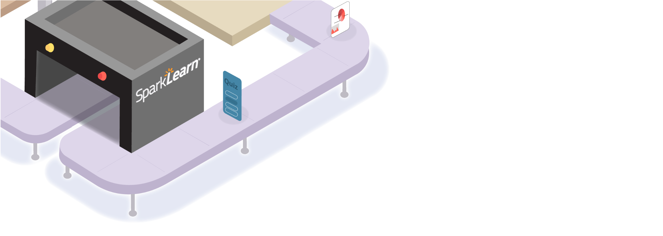
SparkLearn® is doing digital learning differently.
Our flagship product, SparkLearn®, has helped companies around the world succeed in their learning goals leveraging our expertise and experience.


“Float’s culture and products are amazing. ”
— John B. / Sr. Learning Manager